Ranking the PAC 12 Wrestling logos

I know I already did a PAC 12 logo rankings but this time I am going to do the wrestling logo rankings. There are a total of 6 schools for PAC 12 wrestling 3 of which are in the PAC 12 full time and 3 that are a part of the PAC 12 for wrestling only. I also think that none of these logo are bad but with a 6 team format its hard to do a logo ranking. Also before we begin i just want to say………..I DO NOT TAKE CREDIT FOR THESE LOGOS!!!!!!!!! This blog was made just to share my opinion on the Pac 12 wrestling logos. Now lets begin.

6. Stanford Cardinal
As I said earlier all these logos are pretty cool. And this one is no exception. I love the block red S with the white tree. Its a simple design but it looks so good

5. Arizona State Sun Devils
This is a very simple logo. The color scheme looks really good and the pitchfork is a really cool design.

4. Oregon State Beavers
This is a pretty good logo. The color scheme contrasts so well with the beaver and the attention to detail on the beaver is really cool.

3. UA Little Rock Trojans

This is such a great logo The trojan is a very cool design the font is simple but great and the color scheme is great for this logo.

2. Cal Poly Mustangs

This is a really good logo. The mustang looks angry and has a lot of nice detail and the color scheme is so great.

1. Cal State Bakersfield Roadrunners

This is by far the best logo in the PAC 12 wrestling conference. The logos color scheme is great the detail is amazing and I love the way they made the angry roadrunner look.

Thank you for reading my blog on the PAC 12 wrestling logos and i would love to hear your favorite and/or least favorite PAC 12 wrestling logo.
California High School Wrestling Super Conference

First of all I just want to clear one thing out of the way, this is not real but if there was a super conference for high school wrestling in California this is how it would look, according to me. Overall there will be 16 teams in this super conference. Now lets begin.

North Division:

#5 Gilroy Mustangs

#9 Los Gatos Wildcats

#10 Oakdale Mustangs

#20 De La Salle Spartans

#26 Del Oro Golden Eagles

#18 Sobrato Bulldogs

#17 Vacaville Bulldogs

#23 St. Francis Lancers

South Division:

#1 Buchanan Bears

#2 Poway Titans

#4 Palm Desert Aztecs

#11 Granite Hills Eagles

#6 St. John Bosco Braves

#8 Clovis North Broncos

#7 Bakersfield Drillers

#3 Clovis Cougars

Ranking the MAC logos

For those of you who don’t know the MAC (Mid-American Conference) is a college conference that is located in the Rust Belt region of the United States. So today I will be ranking al 12 MAC logos. Also before we begin I just want to say………..I DO NOT TAKE CREDIT FOR THESE LOGOS!!!!!!!! This blog was made just to share my opinion on the MAC logos. Now lets begin.

12. Akron Zips

This logo has to be the worst in the MAC. I don’t like how clunky and weird the A is and also theres no reason to have the school word mark on this logo.

11. Western Michigan Broncos

This logo is super bad. Its just a circle with a very clunky W inside of it. They should have kept their old logo from a few years back.

10. Eastern Michigan Eagles

This is another very bland and clunky logo. Its just an E in the most basic font possible.

9. Miami (Ohio) Redhawks

This is a really bad logo. The M is very clunky, the color scheme is overused, and the white outline is really weird

8. Kent State Golden Flashes

Ok I have one thing to say thats bad about this logo. Why does the lightning bolt look like a bird?

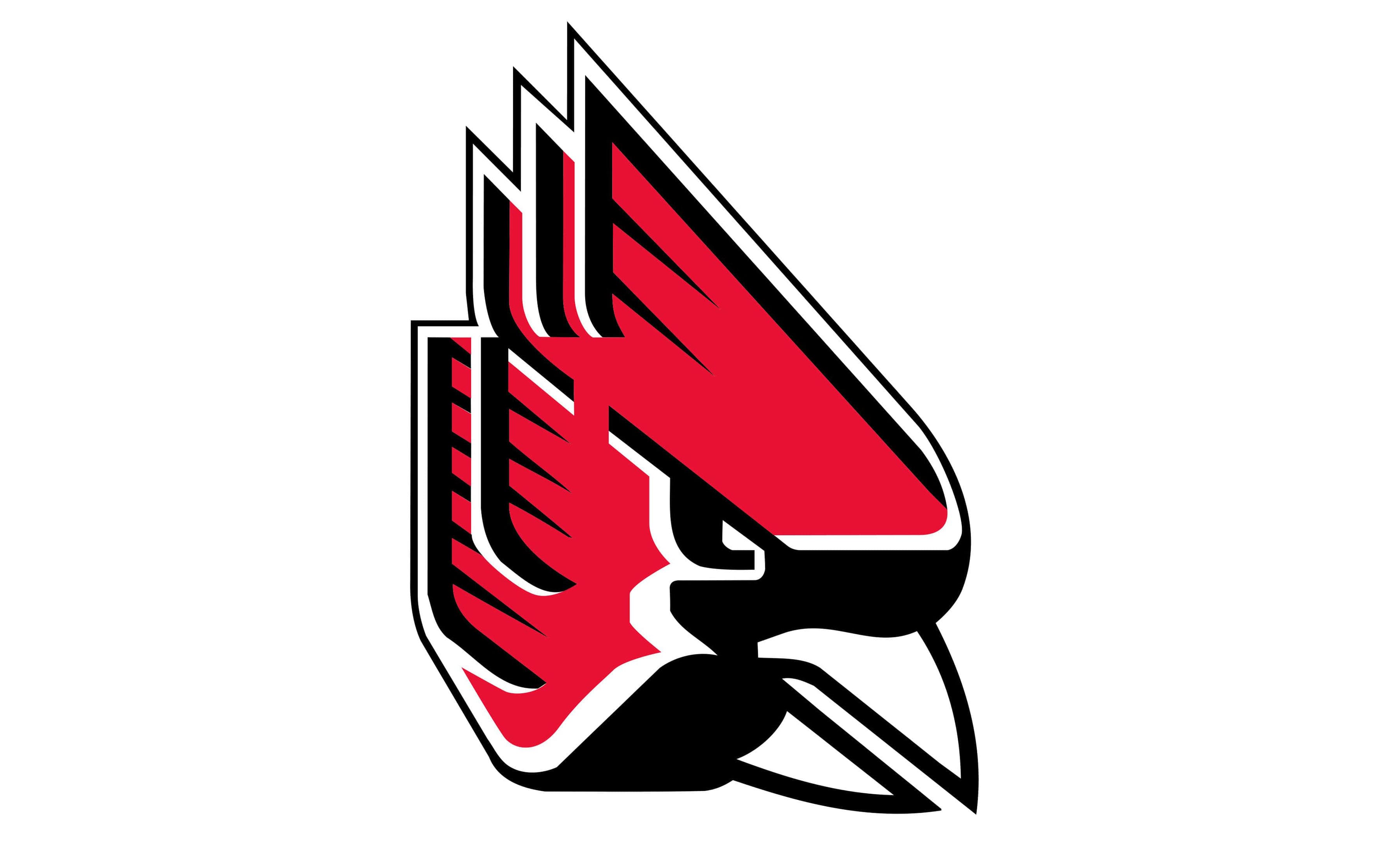
7. Ball State Cardinals

This logo looks super weird. Like I said earlier they have an overused color scheme and the cardinal looks like a robot

6. Central Michigan Chippewas

This is a simple but cool logo. I like the color scheme and the speed lines on the C look pretty cool.

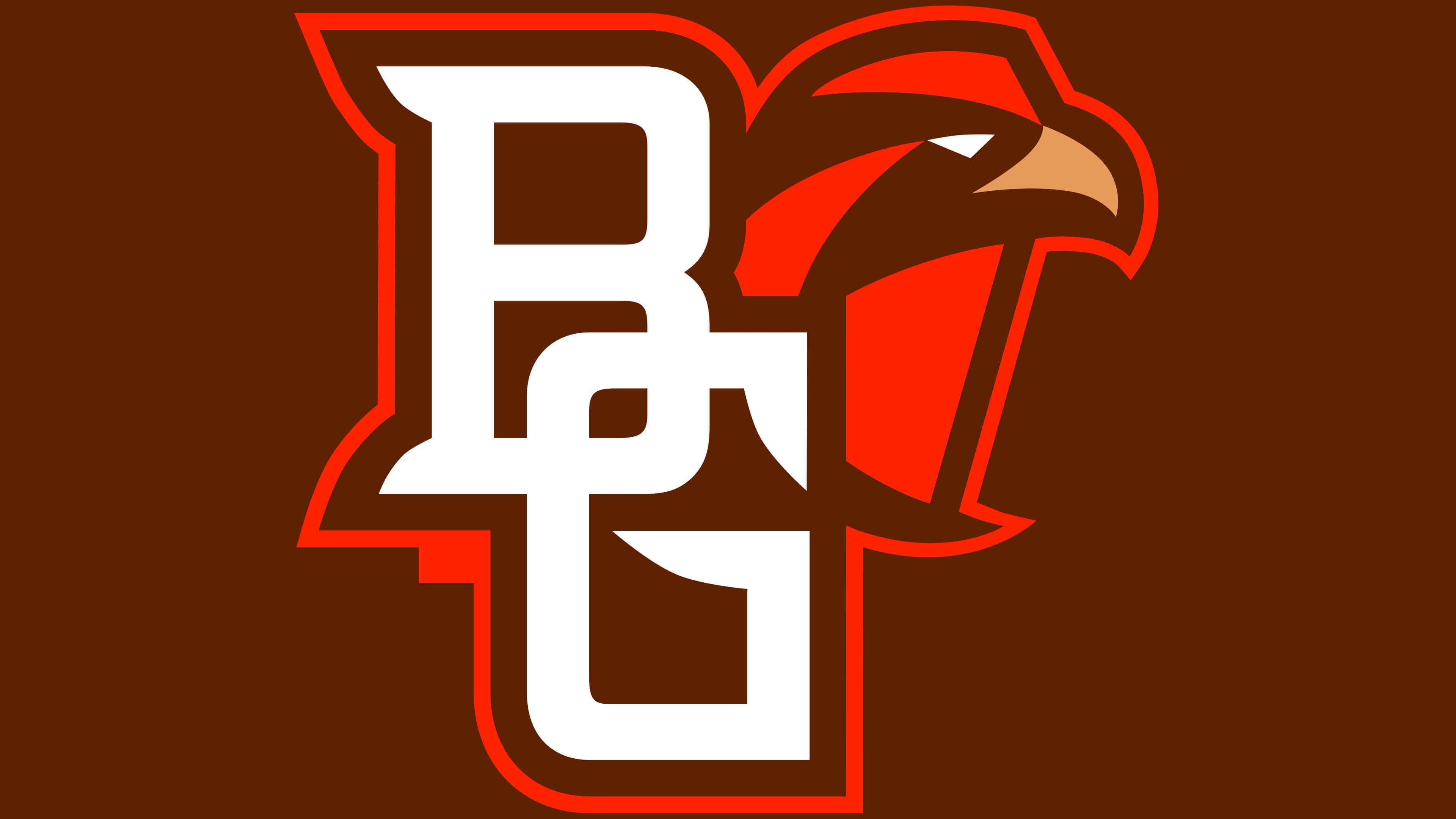
5. Bowling Green Falcons

This is a pretty cool logo. The block school initials are cool and I think the falcon goes great with the color scheme.

4. Buffalo Bulls

This is another simple logo thats pretty cool. I like the solid blue color scheme and the angry bull is really cool.

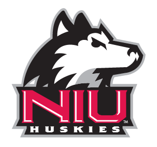
3. NIU Huskies

I know I said this is an overused color scheme, but they make it work. The school word mark is pretty cool and I think the husky is really cool too.

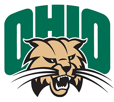
2. Ohio Bobcats

This is a pretty cool logo. I think the school word mark is kinda bland but its made up for by having the angry bobcat in the logo.

1. Toledo Rockets

This has to be the best logo in the MAC. The school word mark is really cool, the navy and gold color scheme is great, and I also love how they made the rocket look. It has a lot of detail.

Thank you for reading my blog on ranking the MAC logos and I would love to hear your favorite and/or least favorite MAC logo in the comments.

Ranking the Ivy League Logos

For those of you who don’t know. Well. I mean. Do I even need to explain what the Ivy League is. Today I will be ranking all 8 Ivy league logos. Also before we begin I just want to say………I DO NOT TAKE CREDIT FOR THESE LOGOS!!!!!! This blog was made just to share my opinion on the Ivy League logos. Now lets begin.

8. Dartmouth Big Green

This is for sure the worst logo in the Ivy League. Its just a block d that looks really clunky. What makes this logo look even worse is the white outline.

7. Brown Bears

This is just like Dartmouth’s logo but in a different color scheme. Once again this is a boring logo.

6. Princeton Tigers

This logo is pretty much just a copy and paste of the bengals logo. But it somehow looks worse than the bengals logo.

5. Harvard Crimson

I do like the color scheme and the shield for this logo, but the H kinda throws me off a little bit. This logo would actually look better if it had a block H in my opinion.

4. Penn Quakers

I love this logo. The red, white, and blue color scheme pops so much. The shield is really cool. I also like the block red and blue P too.

3. Yale Bulldogs

This is a really cool logo. I like the navy and gray color scheme and the bulldog looks really cool too.

2. Cornell Big Red

This is a great logo. The block C looks really good. I also like the bear a lot too.

1. Columbia Lions

This is for sure the best logo in the Ivy League. The columbia blue and navy color scheme is great and the lion looks really cool as well.

Thank you for reading my blog on ranking the Ivy League logos and I would love to hear your favorite and/or least favorite Ivy League logo in the comments.

Ranking the ACC logos

For those of you who don’t know the ACC (Atlantic Coast Conference) is a college conference that is mainly in the Atlantic Coast of the United States. So today I will be ranking all 15 ACC logos. Yes it includes Notre Dame. Also before we begin I just want to say…….I DO NOT TAKE CREDIT FOR THESE LOGOS!!!!!!! This blog was made just to share my opinion on the ACC logos. Now lets begin.

15. Syracuse Orange

This is the worst logo in the ACC. Its just way too simple for me. I like the color scheme but they could have made their logo a little more creative.

14. Georgia Tech Yellow Jackets

The interlocking GT is a pretty cool idea but they could have used a better font for the logo. This is just way too basic.

13. Wake Forest Demon Deacons

I think the font on this logo looks pretty clunky and weird. I also don’t like how its just one solid color.

12. Virginia Tech Hokies

Just like Georgia Tech I think the creativity of the interlocking VT is cool, but I don’t like how its in a very bland font.

11. Miami Hurricanes

I know this logos is a staple in college football. But I think the green and orange color scheme is too overused in sports.

10. Duke Blue Devils

I do like the diamond pattern in the center of the D a lot, but I think just solid royal blue is a very overused color in sports.

9. North Carolina Tar Heels

I love this logo. The curvy font is super cool and the navy and Carolina blue color scheme is really good

8. Pitt Panthers

I loved the decision Pitt made when they went back to their throwback logo and color scheme. It script font is so good and the royal blue and yellow color scheme is great.

7. Virginia Cavaliers

I love how simple but cool this logo is. The font for the V is really cool and the orange sabres make the logo pop so much.

6. Louisville Cardinals

I have always loved the angry cardinal logo. The detail on the cardinal is pretty good and the color scheme is cool too.

5. Boston College Eagles

I think this is a pretty cool logo. The maroon and gold color scheme goes great with the eagle and school initials and the eagle looks really cool too. I like how they made it look like its swooping down.

4. Clemson Tigers

This is a very basic logo, but it works. The tiger paw pops so much with the orange color scheme and I love the small little detail they put on the tiger paw. It makes it look like a real paw print.

3. Notre Dame Fighting Irish

This is such a classic and iconic logo. When you think of college football you think of Notre Dame. The color scheme is great and the interlocking ND is super cool. Its a very simple logo but it looks great.

2. NC State Wolfpack

This is such a cool logo. I think the cartoon wolf is really cool and the sailor hat that says NC State is super cool too.

1. Florida State Seminoles

This has to be the best logo in the ACC. The seminole looks really cool I love the small detail how it says FSU on the feather and the maroon and gold color scheme looks super cool.

Tank you for reading my blog on ranking the ACC logos and I would love to hear you favorite and/or least favorite ACC logo in the comments.

Ranking the Missouri Valley Logos

For those of you who don’t know the Missouri Valley is a college conference that is located in well the Missouri valley region of the United States. So today I will be ranking all 12 logos in the conference. Also before we begin I just want to say…………I DO NOT TAKE CREDIT FOR THESE LOGOS!!!!!! This blog was made just to share my opinion on the Missouri Valley Conference logos. Now lets begin.

Copyright: 1000 Logos

12. Bradley Braves

Copyright: Bradley University

This has to be the worst logo in the Missouri Valley Conference. I really hate how basic it is. Its just a block B inside a shield.

11. Valparaiso Crusaders

Copyright: Valparaiso University

This logo runs into the same exact problem as the last on on this list. Its just block lettering inside a shield. Boring.

10. Evansville Aces

Copyright: University of Evansville

What is it with Evansville, Houston, and Kentucky having pretty much the same logo. I think its super unoriginal and boring. Just read my Big 12 and SEC ranking blogs its super similar and not in a good way.

9. UIC Flames

Copyright: 1000 Logos

With a team name like the flames can’t you at least incorporate fire in your logo instead of just some block lettering. Its super boring.

8. Indiana State Sycamores

Copyright: SportsLogos.Net News

I really don’t like how clunky the lettering and the Indiana state outline look in this logo. They could have at least made the state outline more realistic and I would be fine with it.

7. UNI Panthers

Copyright: 1000 Logos

As much I love the color scheme for this logo I really don’t like the block lettering and also the panther just looks super weird.

6. Missouri State Bears

Copyright: 1000 Logos

This is a really simple logo, but it gets the job done. I think the angry bear looks pretty cool it goes great with this logos color scheme.

5. Drake Bulldogs

Copyright: ESPN

I actually really like the font they used for the block D. It goes really good with the logos color scheme. But the angry bulldog makes this logo look cool. It has great attention to detail.

4. Illinois State Redbirds

Copyright: The Vidette

Once again, I love the font they used for this logo. And I love how angry they made the redbird look plus this logo has a great color scheme.

3. Southern Illinois Salukis

Copyright: SportsLogos.Net

I love how good the color scheme is for this logo. I like how they made the saluki dog look. Its simple but it has some cool detail.

2. Belmont Bruins

Copyright: Logos-World.Net

I think this is a really cool logo. I love the angry bruin it looks super ferocious. I also love the color scheme.

1. Murray State Racers

Copyright: 1000 Logos

This has to be the best logo in the Missouri Valley Conference. The color scheme is great. I also like the block M, but the best part about this logo is the racer. Its such a unique logo for than alone.

Thank you for reading my blog on ranking the Missouri Valley Conference logos and I would love to hear your favorite and/or least favorite Missouri Valley Conference logo in the comments.

Ranking the Summit League logos

For those of you who don’t know the Summit League is a college conference thats spread throughout the Midwest of the United States and today I will be ranking all 10 logos. Also before I begin the ranking I just want to say…………I DO NOT TAKE CREDIT FOR THESE LOGOS!!!!!!! This blog was made just to share my opinion on the Summit league logos. Now lets begin.

Copyright: Wikipedia

10. St. Thomas Tommies

Copyright: CleanPNG

This has to be the worst logo in the Summit League. I don’t like how basic the font is for the letters and I also don’t like the shield.

9. Omaha Mavericks

Copyright: Ticketmaster

This is such a weird and bad design. I really don’t like how the O is in a strange separated pattern. That design just doesn’t need to be there.

8. Oral Roberts Golden Eagles

Copyright: Yahoo! Sports

This logo falls low on the list because I don’t like how they made the eagle look its pretty weird and that dirty gold color looks terrible.

7. North Dakota Fighting Hawks

Copyright: University of North Dakota Athletics

This logo is just way too boring for me. The letters have a very clunky design and I also hate how bland the hawk looks in this logo.

6. Denver Pioneers

Copyright: Logos-World.Net

This logo is also pretty boring. Its just a D and a U in a very basic font. The only reason I put this higher than North Dakota is because of the color scheme.

5. South Dakota Coyotes

Copyright: PNGitem

I don’t like how bland the school initials are in this logo, but it makes up for it by having the coyote paw print in the logo. This logo also has a very good color scheme.

4. Western Illinois Leathernecks

Copyright: Pinterest

I really love the font they went for with the school initials. The color scheme is great too, but the best part of this logo is the angry bulldog.

3. South Dakota State Jackrabbits

Copyright: South Dakota State University

I really love the color scheme they went for in this logo. I also love how great the detail is on the jackrabbit too.

2. North Dakota State Bison

Copyright: SportsLogos.Net

I don’t like how basic the school initials are for this logo. But it makes up for it with a great color scheme. Also the bison looks really cool I really love how the bison is breathing out cold air which of course the midwest is known for.

1. UM Kansas City Roos

Copyright: The Kansas City Star

This is for sure the best logo in the Summit League. What a unique design Its a kangaroo thats wearing a Kansas City sweater. Its such a ridiculous but great logo and I hope they stick with it for the long term.

Thank you for reading my blog on ranking the Summit League logos and I would love to hear your favorite and/or least favorite Summit League logo in the comments.

Ranking the Big 12 logos

For those of you who don’t know the Big 12 is a college conference that is located mainly in the middle of the United States with a few teams in the western and eastern United States. So today I am going to be ranking all 12 teams logos. Also before we begin I just want to say……….I DO NOT TAKE CREDIT FOR THESE LOGOS!!!!!!! This blog was made just to share my opinion on the Big 12 logos. Now lets begin.

Copyright: Dallas Morning News

12. Houston Cougars

Copyright: SportsLogos.Net

This has to be the worst logo in the Big 12. Its just the interlocking school initials. Plus this logo looks so similar to Kentucky just read my SEC logos blog they look almost identical.

11. Baylor Bears

Copyright: Dallas Morning News

This logo just looks super clunky. Its just the interlocking school initials and I also don’t like the weird points on the B and the U. It looks super out of place.

10. Iowa State Cyclones

Copyright: 1000 Logos

I really don’t like how blocky the letters are for this logo. Its just way too simple for me and the A in the logo runs into the same problem as Baylor. The points just look super out of place.

9. UCF Knights

Copyright: ClickOrlando.com

I think this is another very clunky looking logo. Once again the point on the C looks very out of place. And the worst part is that they have such good colors but they don’t have a good logo to accompany it.

8. TCU Horned Frogs

Copyright: Logos-World.net

This logo is pretty bland logo. Its just the school initials in a pretty basic font. But the color scheme is why the logo is so high on the list.

7. Texas Tech Red Raiders

Copyright: 1000 Logos

I do think the interlocking two T’s is a cool design which they should keep but its the different shadings of black and red all over the place that throws me off guard. They should really go back to their old design of this logo when it was one solid color.

6. Cincinnati Bearcats

Copyright: Pinterest

I really love the creativity in this logo. It has a block C but then the C is also supposed to be the bearcats paw as well its just such a great design.

5. Oklahoma State Cowboys

Copyright: tickets.okstate.com

I love the great color scheme for this logo. I also really love how the logo is tilted to the right a little bit to make it have the affect that its moving forward. I have always though that was a great touch.

4. West Virginia Mountaineers

Copyright: 1000 Logos

I have always loved the clever design to this. Its a W on top of a V. and the solid yellow color scheme is great. This logo is almost heaven for West Virginia. Pun intended

3. BYU Cougars

Copyright: Wikipedia

I loved the choice that BYU made when they went back to their throwback colors instead of navy. The oval has always been such a cool design along with the block Y but the royal blue is what makes this logo pop the most.

2. Kansas State Wildcats

Copyright: 1000 Logos

This logo is very simple but its great. Its an angry looking wildcat thats purple thats a pretty unique design. I also like the little point on the logo that looks like an eye that was a cool detail in this logo.

1. Kansas Jayhawks

Copyright: 1000 Logos

This is by far the best logo in all of the Big 12. Its a happy cartoon looking jayhawk that has the school initials inside of it. This logo also has a great color scheme makes the logo I also really love the small detail with the jayhawks claw coming out of the shoe that was really clever.

Thank you for reading my blog on ranking the Big 12 logos and I would love to hear you favorite and/or least favorite Big 12 logo in the comments.

Ranking the AAC logos

Before I begin I just want to mention this is my 100th upload and I just want to thank my readers for your continued support.

For those of you who don’t know the AAC (American Athletic Conference) is a college conference that is located in the midwest and east coast regions of the United States. So today I will be ranking all 15 AAC logos. And yes I know Navy is a football only member but i’m going to include them in this ranking. Also before we begin I just want to say……..I DO NOT TAKE CREDIT FOR THESE LOGOS!!!!!!! This blog was made just to share my opinion on the AAC logos. Now lets begin.

Copyright: 1000 Logos

15. Charlotte 49ers

Copyright: Wikiwand

I put this logo in last because the pickaxe inside the block C just makes the logo look super weird.

14. Temple Owls

Copyright: Wikipedia

This is yet another weird looking logo. It looks like a maze on a kids menu. I also don’t like the flag design that they have.

13. Rice Owls

Copyright: 1000 Logos

I think this logo is just too bland. It looks like the Detroit Tigers logo but instead of and english D its a English R. They could have at least had the Texas state outline on the logo too.

12. Tulsa Golden Hurricane

Copyright: Tulsa World

I think the hurricane warning flag in this logo is pretty cool. But it just throws me off guard with the gold word mark. The gold is just way too dominant on this logo.

11. Navy Midshipmen

Copyright: 1000 Logos

This logo is more basic than the last few. Its a block N with a word mark below it. However I do like the star on the logo for sure makes it pop more.

10. FAU Owls

Copyright: Florida Atlantic University

I think this is a very weird looking logo. The school initials look kinda cool with the wings on the sides of the logo. But the owl below the school initials just looks super out of place and pretty weird.

9. USF Bulls

Copyright: 1000 Logos

I really love the design for this logo. Its a bulls face but the face makes a U for university which is really cool. I also like the color scheme for this logo.

8. North Texas Mean Green

Copyright: Dallas Morning News

This logo is pretty cool. Its a green eagle that looks like its swooping down. But the color scheme really makes this logo for me.

7. UTSA Roadrunners

Copyright: UTSA

This logo is very simple but really cool. Its the roadrunners face with a cool color scheme.

6. Memphis Tigers

Copyright: Grand City Designs

I loved the choice that memphis made when they changed the logos color scheme. Its an angry grey tiger jumping over a block M. How cool is that.

5. UAB Blazers

Copyright: 1000 Logos

I mean what else can I say. Its a fire breathing dragon. That has to be the most unique logo in all of sports in my opinion.

4. SMU Mustangs

Copyright: Dallas Morning News

This logo is way more simple than the last few. But the reason this logo is so high on the list is because they have had this same logo since the 50’s and the charging mustang has just become a staple in sports logos.

3. Tulane Green Wave

Copyright: SportsLogos.Net

I think this is such a strange but cool logo design. Its an angry wave with fists. Plus the color scheme for this logo is so great.

2. East Carolina Pirates

Copyright: Logos-World.Net

This is a great logo. I love the purple pirate hat with the school initials. But was makes this logo stand out is for sure the pirate skull with the eye patch. It makes for a great logo.

1. Wichita State Shockers

Copyright: Wichita State Athletics

This is by far the best logo in the AAC.I really love the black and yellow color scheme for this logo and I really love how the logo is the schools mascot (Wushock) because not much teams have their mascot as their logo.

Thank you for reading my blog on ranking the AAC logos and I would love to hear your favorite and/or least favorite AAC logo in the comments.

Ranking the SEC logos

For those of you who don’t know, the SEC (Southeastern Conference) is a college conference that is located in the Southeast region of the United States. So today I will be ranking all 16 SEC teams. Also before we begin I just want to say………I DO NOT TAKE CREDIT FOR THESE LOGOS!!!!!!! This blog was made just to share my opinion on the SEC logos. Now lets begin.

16. Alabama Crimson Tide

Copyright: Sports & Entertainment Travel

This has to be the worst logo in the SEC. I think the A in this logo just looks super weird. It looks like a watered down version of the braves logo. But i’m bias I hate Bama. However it doesn’t take away from the fact it is a terrible logo.

15. Vanderbilt Commodores

Copyright: Vanderbilt University

I did not like Vandy’s logo change this year. It looks way too basic and the black and gold color scheme does not really go together that well. If they stuck with their old logo from last year this would be higher on the list

14. Kentucky Wildcats

Copyright: 1000 Logos

I think this logo is just way too basic. Its just a solid royal color in the most basic font possible

13. LSU Tigers

Copyright: Kindpng

This logo is very boring. Its just the school initials in a very basic font. The only real thing this logo has going for it is the color scheme.

12. Oklahoma Sooners

Copyright: 1000 Logos

This logo has an even more basic font than the last one but the reason its higher than LSU’s is cause its classic but I do wish the logo had a white outline to it.

11. Mississippi State Bulldogs

Copyright: hailstate.com

This logo has yet another basic font but I do think the banner is pretty cool and it goes well with the color scheme.

10. Auburn Tigers

Copyright: 1000 Logos

This logo is pretty basic but the color scheme works with it and the interlocking school initials are pretty cool as well.

9. Tennessee Volunteers

Copyright: 1000 Logos

This logo is just a basic T but I really love the font for this logo and the solid orange color scheme is great.

8. Ole Miss Rebels

Copyright: ClipartMax

I just love the solid red color for this logo and I really love the script they used for the school word mark.

7. Georgia Bulldogs

Copyright: 1000 Logos

Yeah I know what you’re thinking with this logo. The Green Bay Packers. But I really think Georgia did great on making their own version of the logo and I personally think the color scheme looks better than the packers.

6. Texas A&M Aggies

Copyright: 1000 Logos

This is actually the new Texas A&M logo as of this year and I love it. They didn’t get rid of the iconic school initials logo but instead improved it by adding the Texas state outline to the logo.

5. South Carolina Gamecocks

Copyright: University of South Carolina

Even though the block C in this logo is pretty basic I just love the detail on the gamecock itself. It looks very ferocious and the color scheme goes great with the logo.

4. Missouri Tigers

Copyright: 1000 Logos

I love this logo. The angry tiger looks super cool and the color scheme goes really well with this logo and even though its a small detail I do like the oval surrounding the tiger.

3. Florida Gators

Copyright: Pinterest

This logo is actually very similar to the last one but instead of an angry tiger its an angry gator but its such a cool logo and I really love the color scheme to this logo too.

2. Arkansas Razorbacks

Copyright: 1000 Logos

I love this logo. The charging razorback logo and the color scheme is great. I also love the history is of this amazingly logo. They have had the same logo since the 50′

1. Texas Longhorns

Copyright: kindpng

This is by far the best and most historic logo in the SEC. The burnt orange longhorn from a front view. And the best part is that they have had this logo for pretty much their entire existence.

Thank you for reading my blog on ranking the SEC logos and I would love to hear your favorite and/or least favorite SEC logo in the comments

Design a site like this with WordPress.com
Get started